Overview
Fannie Mae's Developer Portal is a public-facing site empowering anyone to access Fannie Mae mortgage and housing data through API calls.
With Fannie Mae playing an integral role in how mortgages originated and later sold on the secondary mortgage market, giving data access to technology service providers (TSPs) and lenders is key. The Developer Portal product team knew the site was overdue for an update, to help users quickly get access to the APIs they need to serve their slice of the mortgage lifecycle.
My Role
• Content strategist
• Content editor
• Content editor
I worked closely with a product owner, developer, and a UX designer on the homepage/landing page.
Tools I used
• Excel: to audit and edit all existing page content
• InVision: to leave feedback on high-fidelity mockups
• InVision: to leave feedback on high-fidelity mockups
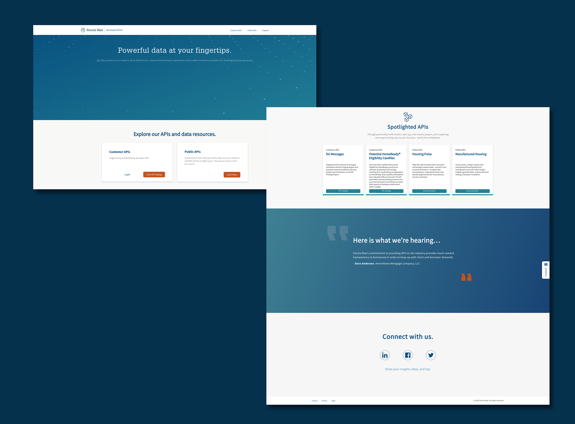
Easier access to data
The current Developer Portal homepage wasn't set up to help users quickly get in and get out.
• A large animated illustration distracted users and didn't support the content around it
• It took a few scrolls to find the login information for return developers
• Too much space wasted on testimonials
• Not enough information about the site's value proposition
• It took a few scrolls to find the login information for return developers
• Too much space wasted on testimonials
• Not enough information about the site's value proposition
Process
I was brought into this work closer to delivery. That meant I didn't get the opportunity to conduct my own research to understand how content plays a part in a user's journey. This also meant I didn't have a chance to test the content with users.
Based on the synthesized research our UX designer conducted, users needed:
• Basic information about the site (what it is)
• Easy access to get started
• The ability to explore our current catalog of APIs (regardless of customer vs. public API)
• Basic information about the site (what it is)
• Easy access to get started
• The ability to explore our current catalog of APIs (regardless of customer vs. public API)
The header seemed like the most logical space to add content to support users' needs, considering the current page has a lot of wasted space.
I took an audit of the current content:
• Nav/menu items
• A one liner val prop in the header
• Two CTA buttons (get started and API catalog for newbie devs)
• Quick start content
• APIs catalog callouts
• Spotlighted APIs
• Testimonials
I took an audit of the current content:
• Nav/menu items
• A one liner val prop in the header
• Two CTA buttons (get started and API catalog for newbie devs)
• Quick start content
• APIs catalog callouts
• Spotlighted APIs
• Testimonials
Our UX designer was leaning toward a more compact homepage style. So I worked alongside him to combine duplicative sections of the site and surface the most important information earlier on in the experience.
RESULTS
We now have a new landing page!
• Created all-new header content in the carousel, which now highlights the Dev Portal's three main val props
• Added new CTAs in the header to drive users to get started or explore the site
• Created quick start directions so new users can onboard quickly
• Moved testimonials to a new Use Cases section
Next steps
I'm in the process of updating other sections of the site, which I hope will follow closer suit to the homepage.
What I'd love to see in a future release:
• The opportunity to test different versions of the content throughout the site
• A more robust use case section
• Remove the header carousel in favor of a single val prop that we can A/B test
• Improved header imagery or illustrations that align closer to the brand
• The opportunity to test different versions of the content throughout the site
• A more robust use case section
• Remove the header carousel in favor of a single val prop that we can A/B test
• Improved header imagery or illustrations that align closer to the brand
