Overview
When I joined Notarize, I was the very first content hire the company ever had. There was no digital marketing department, no marketing designers, no marketing operations.
In order to start adding scalable value, I leaned into what I knew best: content. There was no shortage of content work to tackle: product content, blog posts, CTAs, sales development content, emails, events, and beyond.
When there's a lot to conquer, you have to start small. I started making incremental improvements on the Notarize blog, which was the top driver of organic traffic to Notarize.
My role
Everything? I was a content team of one!
Since I was the first marketing hire (and stayed a team of one for the first three months of my employment there), I tackled all content and design.
Since I was the first marketing hire (and stayed a team of one for the first three months of my employment there), I tackled all content and design.
Tools I used
• Sketch: to mock up and edit the new CTA unit
• Hubspot: to publish the new CTA to the global blog template
• Hubspot: to publish the new CTA to the global blog template
Why a small Sidebar was so impactful
The CEO, who managed our content before I joined the team, gave me a heads up that our organic traffic was good.
Like, really good.
The main driver to our great organic traffic was the fact that there was little competition on high-value search terms pertaining to notarization on Google.
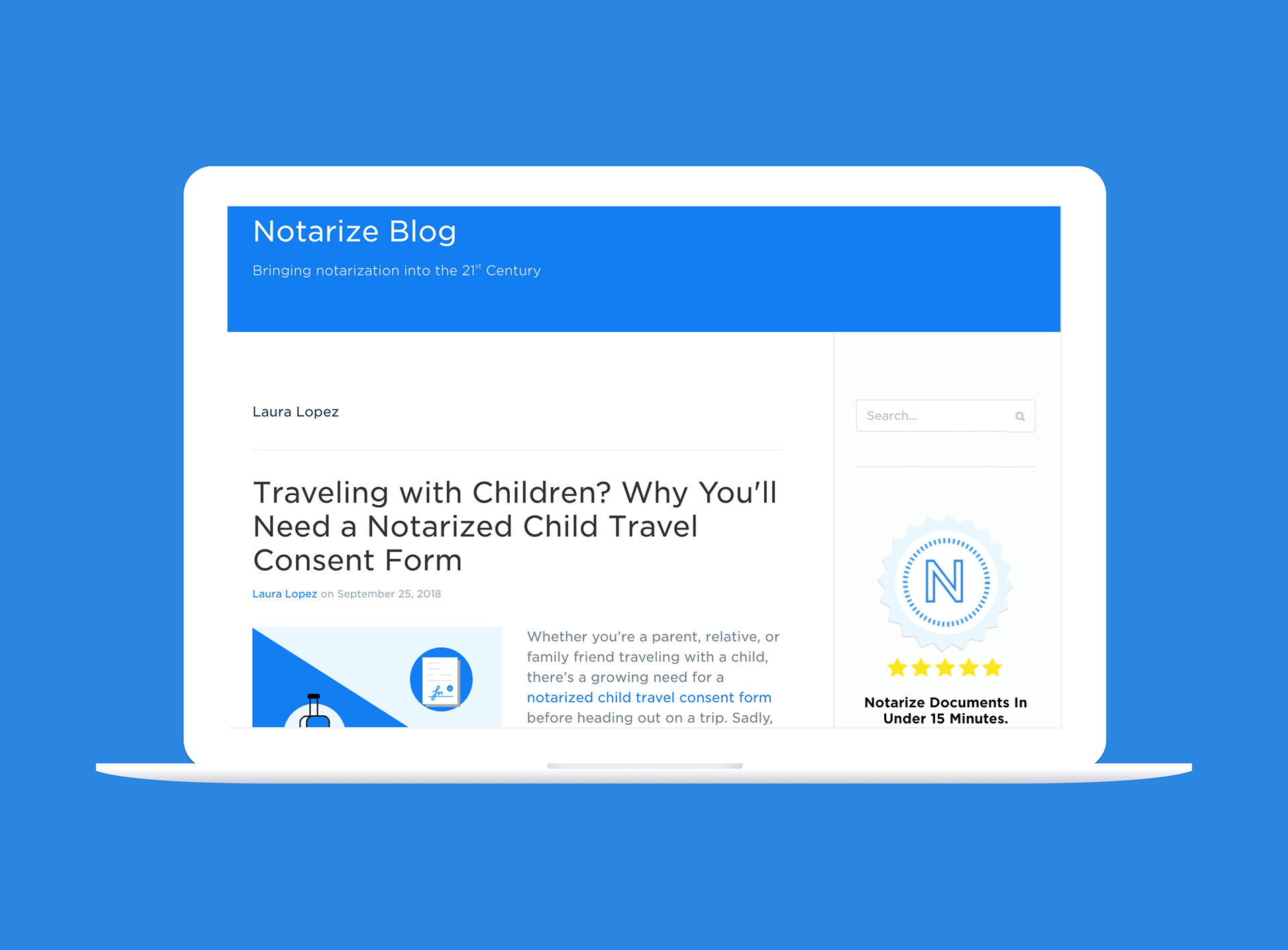
To drive organic traffic to our product offerings, our blog had sidebar CTAs. Despite getting clicks, I saw very few conversions.
After digging into the analytics, I attributed this to:
• Too many CTA buttons: one is great but three was analysis paralysis
• Misleading graphics: we had a graphic of the United States but online notarizations were not legal in all 50 states
• Incorrect main CTA: our product has a desktop/web app experience and a mobile app. You wouldn't need to download the app on desktop
• Weak supporting CTAs: Both "Sign Up" and "Notarize for Business" point to our B2B solution, which conflicts with the main CTA, geared towards consumers
A better CTA experience
I changed a few things in the new sidebar:
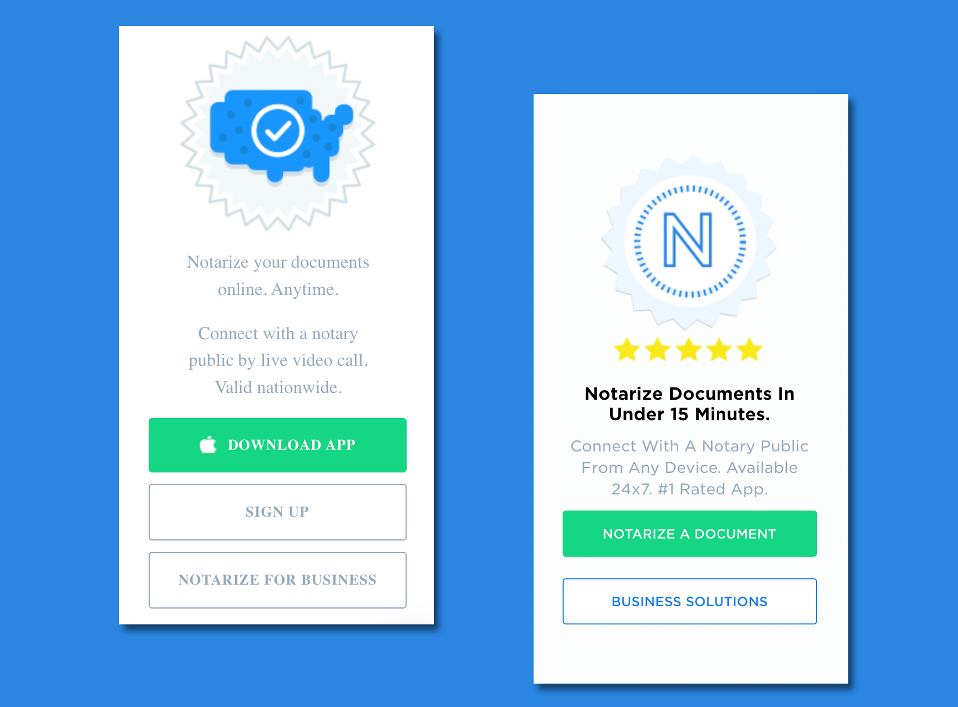
• Edited the value prop microcopy: notarizations have a bad reputation of taking a long time. One of our key val props is speed. I worked with product to find out just how long an average notary meeting lasted (just under 15 minutes) and used that as a hook
• Changed the image: leaned into our notary "stamp" iconography used throughout our branding and incorporated it in the sidebar
• Changed the main CTA: I made the main CTA's microcopy more vague, for a reason. If users clicked "Notarize a Document", the site could detect if you were on a mobile device and would push you to the App Store. If you were on a desktop, it would push you to the web app experience, removing barriers to users notarizing a document
• Combined supporting CTAs: I combined the microcopy to push users to our B2B landing page, resulting in an 12% increase of traffic to the Notarize for Business landing page in its first month
If I had more time...
When you're a content team of one, there are no shortage of problems to solve with words. But, if I had more time:
• A/B test different CTAs to drive people to different parts of the site. It's a small but mighty piece of the blog, so why not funnel that traffic elsewhere?
• Test adding another CTA: does this get clicks because it's the only one? Or is there more to understand about user intent here?
• A/B test different CTAs to drive people to different parts of the site. It's a small but mighty piece of the blog, so why not funnel that traffic elsewhere?
• Test adding another CTA: does this get clicks because it's the only one? Or is there more to understand about user intent here?